Graphic designers share their thoughts on four of this year’s exceptional book covers
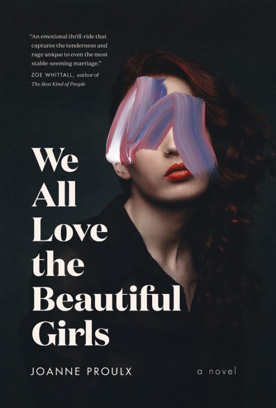
We All Love the Beautiful Girls
Joanne Proulx
Viking Canada
“The moment I saw Jennifer Griffiths’s cover design I knew it was going to be a favourite among the design bloggers for 2017. The stacked restraint of the title typography (in one of the more favoured fonts of the past year, Domain Display) is all that’s required to balance against the subdued drama of the cover image. While the theme of the “faceless woman” is not new in book covers, this moves the mark into a more artful realm that informs on the book’s heavier themes of desperation and violence. Obscuring the eyes and cover model’s emotion with a painterly stroke is disturbingly beautiful, and all that is needed to hook the reader.” –Rose Pereira is a magazine and book designer.

The Chemical Life
Jim Johnstone
Signal Editions
“The simple starkness of David Drummond’s cover really draws me in. The deep-red background, suggesting danger or a warning; the used matchbook, with the remaining battered matches curled up like grasping fingers. There’s a need in this image – a craving has just been fulfilled or still needs to be – that reflects the poet’s allusion to drug use. The clean, sans-serif typography is perfectly handled too. Having it run along the remains of the torn matchbook cover on an angle could have been dangerous to readability, but the simplicity of the overall design allows the type to stand out beautifully.” –John Montgomery is the art director of Reader’s Digest Canada.

All We Saw
Anne Michaels
McClelland & Stewart
“This cover works by asking questions: Is this hand dirty or charred? Is this the hand of a sculptor, baker, or coal miner? The image is all about tone. And somehow all the subtlety of tones and gradations allow Janet Hansen, the designer, to get away with a title that is more, rather than less, powerful for being small, sitting confidently at the end of our eyes’ journey as they move down along the fingers. This cover makes me think of white sheets, of fog and dusk, rain darkening concrete, and the naked fingers that must be attached to an arm and a whole body; a suggestion of some missing man, the mortal, and – first and foremost – a sense of touch.” –Jason Logan is creative director of the Metro newspaper chain and the clothing line Horses Atelier. He is also founder of the Toronto Ink Company and author of three books.

One Day We’ll All Be Dead and None of This Will Matter
Scaachi Koul
Doubleday Canada
“This is great on a conceptual level – it captures both the light-heartened tone and the heavy subject matter of the book. C.S. Richardson’s design is overtly feminine (I’m looking at you, magenta) and equally badass. The layered title is really smart. It forces you to do a double take to absorb it, and once you have, you can’t help but laugh at the truth behind it. It takes a lot of restraint to design something so simple.” –Nicola Hamilton is the art director of Studio Wyse in Toronto.
 Contact us via email