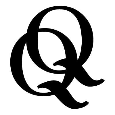
 There are lots of changes happening over at ECW Press. In July, the Toronto publisher moved locations, and now it’s launched a new logo and website.
Q&Q asked David A. Gee, who designed the logo, about the thinking behind the new look:
It’s actually the end result of a rather long and casual process. As ECW didn’t have a fixed logo on the spines of their books, designers were let loose to set “ECW” however they saw fit. I got into the habit of building little jokes into how I set the initials on the spine, riffing on the front cover. A couple of years ago I was asked if I had any other treatments similar to a spine “logo” I created for a book cover. This started an on-and-off again conversation around a new logo and I just got to work, slowly, on thinking about what this could look like, knowing that their first logo from 1974, an alchemical symbol, was a great starting point, as was the robin’s-egg blue colour of their first title (Essays on Canadian Writing). There were, I think, six logos presented in total, over the span of a couple of months.
I have to admit that the whole process, from initial conversations to evaluations and revisions, was really loose, organic, and fun, and felt strangely self-directed. It never felt like a commission. It was like they gave me the idea to propose a new logo to them. There were no real parameters, either. The whole Dutch-tilt thing was a completely last-minute decision, too. I was already halfway through designing all the stationery, business cards, etc., when it hit me that at 45 degrees, the logo was instantly so much more in keeping with their approach and philosophy. It felt right. I think I just said “By the way, we’re doing this instead” and they were open to it. Most clients would flip if a designer did something like that at such a late stage.

 Contact us via email

