Cover credit: Design: Kelly Blair
In cover design, big type and bright colours aren’t so much a trope as they are a necessity. Now that it has become essential for a cover to grab our attention as a thumbnail on a screen, that necessity has become exaggerated. Colours that glow on a backlit screen are of vital importance, and scale requires type to be bigger and bolder. Though soft, amorphous, colourful shapes and large sans-serif white type have become almost a cliché, their effectiveness on a small screen can’t be denied.
Sadly, the need to provide for digital screens has removed some of the classic elements of print design. Book designer David Gee notices that “negative space has become something of a no-no. Whether it’s insanely eye-melting imagery or type, every inch of book covers seems to be filled with visual information.” White space is notoriously tricky to master, but it has practical drawbacks: in print, it’s a magnet for smudgy fingerprints or sales stickers, and on a screen, a design with lots of white can blend into the rest of a web page. “Perhaps there’s a secondary underlying practicality to [covers without white space], in that they allow for plenty of bestseller-list stickers and notable endorsements buttons with little to no effect on overall design,” Gee says.
Technology hasn’t just affected how covers are designed; it’s also influenced their creation. Dan Wagstaff, blogger and marketing manager at Publishers Group Canada, thinks that trends can be attributed to the common restraints that designers have to work with, as well as the tools they use. “There’s a little bit of a trap in looking for trends. Designers are working with a very limited format – books are standard sizes, and they require quite a lot of type on the front cover,” says Wagstaff. “Then you’re looking for something to make it impactful. So when I see some of these trend pieces, what they’re really noticing is that books are these attention-grabbing rectangles with bright colours!”
Design software like InDesign (for page layout) and Photoshop (for photo editing) are standard across the industry, and this can also lead to a reliance on the same preset tools and techniques. “A couple years ago, there was a trend of cut-out concentric circles,” says Wagstaff. “I think in the old days, doing that would have been quite difficult – if not impossible. The collage would have been done painstakingly by hand with paper and a scalpel. Nowadays, digital tools make these kinds of perfect layers and brilliant visual effects seem effortless.”
Advancements in printing have allowed more creativity in design while also making these options available to more publishers. As Wagstaff notes, “My sense is that publishers have a greater awareness of the importance of design and production values than they did 10 or 20 years ago, and the quality and affordability of modern printing enables you to do things that maybe weren’t possible before. Independent publishers can afford covers that look a little bit fancier than they could previously.”
As vital as designing for digital is, its influence on book design could still be temporary; trends inevitably come and go. As Gee notes, “How long ago was everyone discussing the trend of using gold foil on everything – five years?”
Cover credits (l to r): Design: Kelly Blair; Design and illustration: Sophie Paas-Lang, Design and illustration: Jennifer Griffiths
Revenge of the Blobs
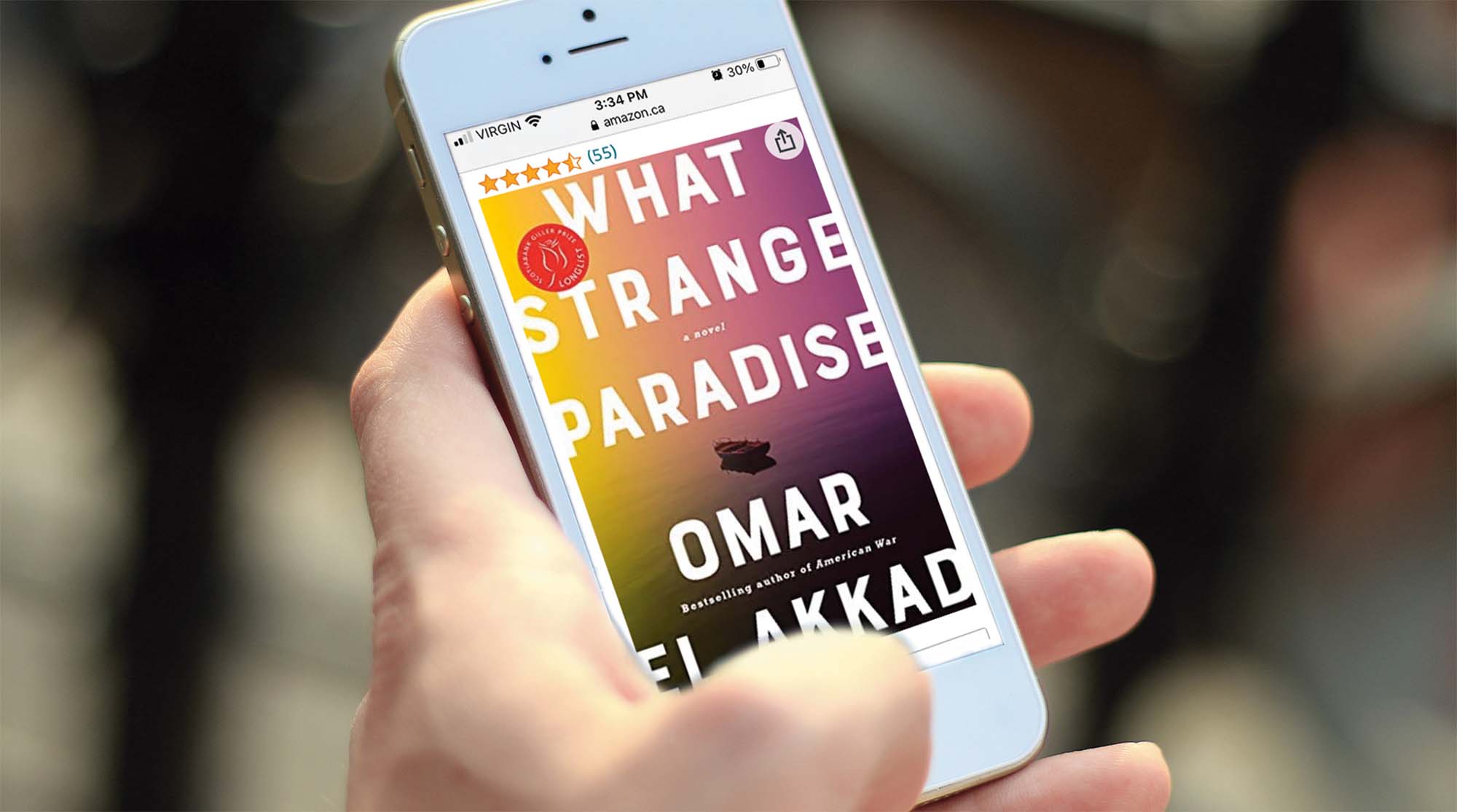
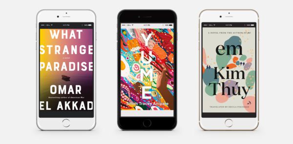
Commentators have derisively described it as “blob design,” but in the examples above, designers move beyond this trope with the addition of details that encourage a closer look: the chopsticks holding the U in Yume add wit and depth to the title by lifting it (literally) off the background; the tiny abandoned boat in What Strange Paradise creates a seascape from abstract colours while echoing the strange in the title; and the tiny black shapes in Em are actually pairs of figures – some are running, others are armed soldiers, hinting at the story behind the serene petal-like shapes.
Cover credits (l to r): uncredited; Design: Kimberly Glyder; Design: Michel Vrana
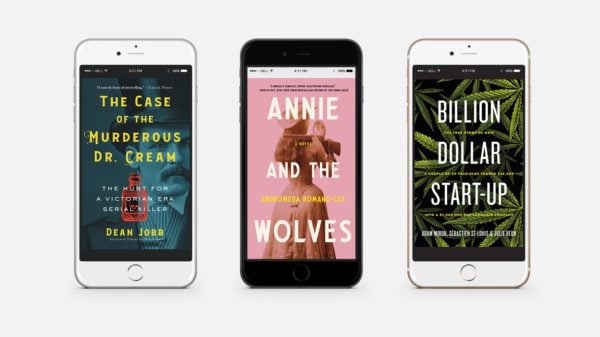
Even when the design requires an antique image, cover designers are adapting for digital screens: Annie and the Wolves and The Case of the Murderous Dr. Cream both use pre-digital images but contrast those images with intense colours. Secondary text in Annie and the Wolves and Billion Dollar Start-Up are picked out with vibrant yellow, between the bold white title; meanwhile, the title and author’s name for The Case of the Murderous Dr. Cream are set in an antique typeface, yet the colours are modern, intense, and slightly acid. The red bottle with a skull on the label is a not-so-subtle hint at the doctor’s crimes.
Woke up like this
Young adult fantasy fiction has seen a boom in young, talented female authors breaking away from the stereotype of the middle-aged male fantasy writer of previous generations. So why do so many of today’s YA fantasy book covers still share elements with the book covers of 1973? The wave of fan fiction inspired by existing series, from Harry Potter to Twilight, has eroded the traditional barriers to publishing fantasy and created books that reject the gender and racial tropes of previous generations. Despite this, the perfectly groomed female figures from your dad’s Conan the Barbarian covers still seem to be around.
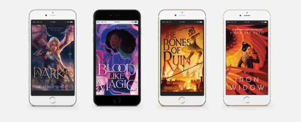
Cover credits (l to r): Design: Laura Eckes, Illustration: Christophe Yoong; Design: Rebecca Syracuse, Illustration: Thea Harvey; Design: Rebecca Syracuse, Illustration: Khadijah Khatib; Art Direction: Terri Nimmo, Design: Talia Abramson, Illustration: Ashley Mackenzie
There are significant differences, though. For one, Conan is nowhere to be seen. These women are dynamic, diverse, and purposeful and are the stars of their own stories. They’re certainly not as underdressed as the women cowering behind the heroes of previous fantasy covers. Now, they are the heroes. Though they still adhere to conventional standards of beauty, perhaps that’s because it’s one of the tropes that make this genre appealing? There must be: ornate Gothic type; elaborate costumes; magic; flames; magic flames; but also great makeup and always, always, perfect hair.
This article has been corrected to include credits for designers of book covers shown, which were omitted in the print version of the magazine.
 Contact us via email