 Their plots are as taut as Gillian Flynn’s and their social takes as pointed as Zadie Smith’s. Yet for all their contemporary relevance, classic novels by authors such as Edith Wharton and Emily Brontë too frequently come packaged behind oil-portrait covers with swooping antique fonts.
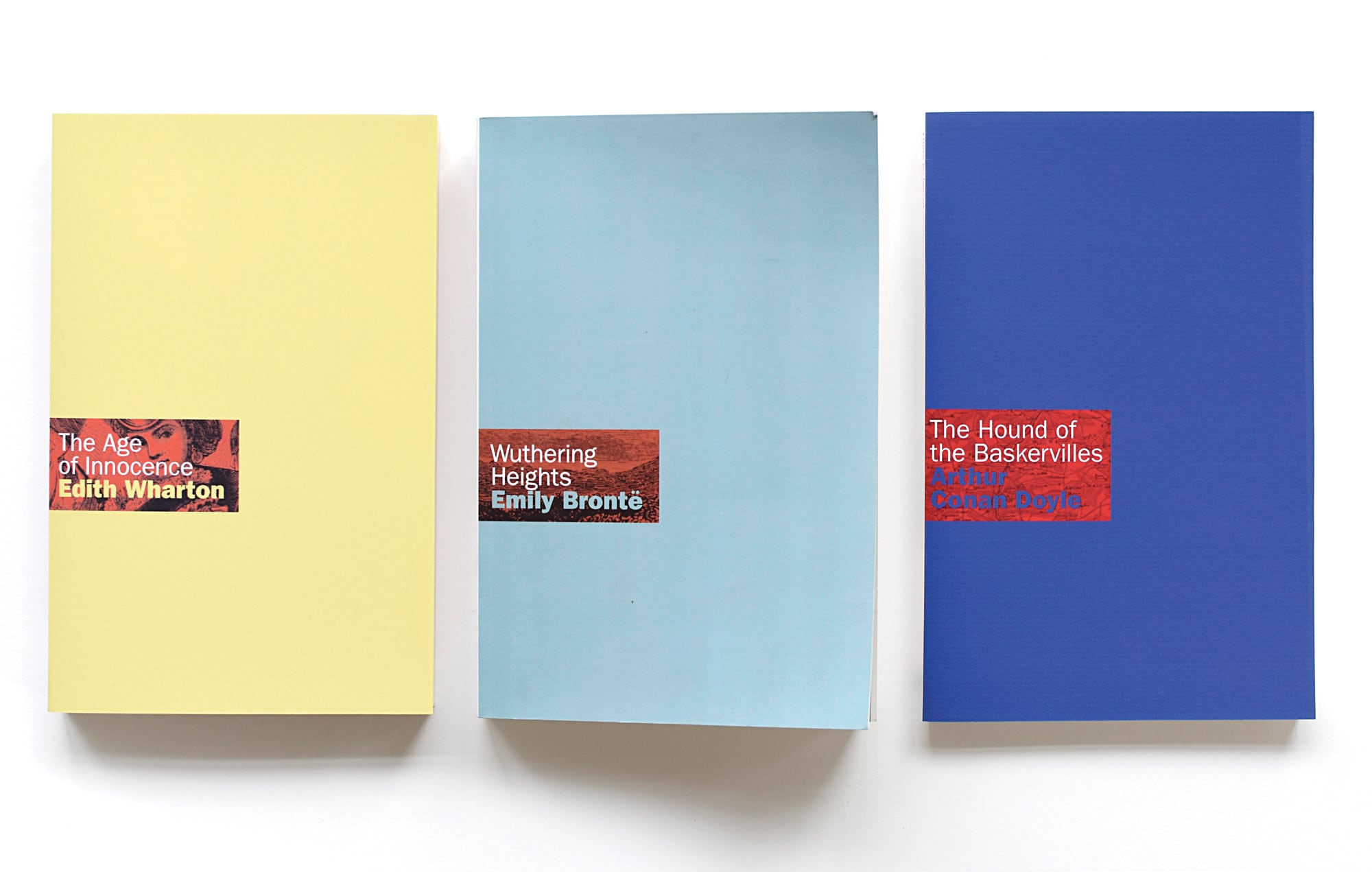
That disconnect is what inspired Toronto graphic designer Ingrid Paulson to publish such classics in brilliant colours and with spare design elements, channelling a modern European aesthetic. Paulson, whose cover designs include André Alexis’s Fifteen Dogs and Tamara Faith Berger’s Queen Solomon, launched her own Gladstone Press with an ultramodern redesign of Brontë’s Wuthering Heights on July 30, Brontë’s birthday. Arthur Conan Doyle’s The Hound of the Baskervilles and Edith Wharton’s The Age of Innocence will follow.
Many of the chosen books – available at GladstonePress.com – are Paulson’s personal favourites. “The criteria was they had to be entertaining,” she says. “They couldn’t be dry or tedious, although that’s subjective. They also should still be relatable to a contemporary reader. That does include careful readings for racism and sexism.” She rejected Wharton’s The House of Mirth, for instance, for its broad stereotyping of Jewish lawyer Simon Rosedale.
Along the books’ spines, Paulson features quotes from the novels. “People can get a sense of the book before they pull it off the shelf,” Paulson says. The covers are almost entirely done in one vibrant colour. “Those bright, candied, jewel-toned hues that are out on the market right now. Everybody seems to really want something happy.”
The colours are offset by a small bar that showcases the book’s title and gives a glimpse of an etching. The full sketch is revealed as the reader opens the book to the title page. For Wuthering Heights, Paulson found an image of the English moors. For The Age of Innocence, she sourced an 1870s illustration of society lords and ladies whispering at the theatre. It’s part of how Paulson allows the titles’ histories to reverberate through her contemporary aesthetic. Another is the cover font: Franklin Gothic, a modern update of the Gothic fonts of the 1900s.
While reissues will be Gladstone Press’s immediate focus, Paulson hopes to one day discover and publish her own contemporary Brontë. “This is the first step in what I hope is not just an experiment,” she says. “I want this to be a full publishing press.”
 Contact us via email