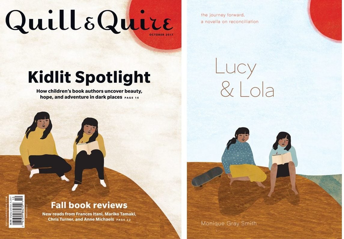
 In the magazine world, finding an artist to create an illustrated cover that suits an issue’s theme, often on a quick turnaround, can be a challenge. For Q&Q’s October 2017 issue, which included a kidlit spotlight and a focus on Indigenous content and creators, making sure the illustrator was a good fit was even more imperative than usual. Inhabiting both of those worlds, Cree-Métis artist and children’s book author-illustrator Julie Flett immediately came to mind.
Q&Q art director Erin McPhee reached out to Flett, but the artist was unsure about doing the cover illustration, as she was too busy working on other projects. One of these was a cover and spot illustrations for The Journey Forward, A Novella on Reconciliation: Lucy & Lola (McKellar & Martin), a forthcoming middle-grade book by Monique Gray Smith. But after reading a draft of the Q&Q essay Smith had written (“Who am I to write a book like this?”), which mentions Lucy & Lola, the idea of doing a simple illustration inspired by the twin sister protagonists took root. Flett had already read the book’s manuscript but decided to base her Q&Q cover solely on what Smith had revealed in her essay. “She had only given away so much in her piece, so I wanted to be true to what I’d read in the article,” explains Flett.
The result was a beautiful image of two girls sitting on a hillside, rendered in an earthy palette of russets and rusts using a combination of pastel and collage.
Smith knew Flett (whom she calls “the matriarch of Indigenous illustrators”) was doing the Q&Q cover but was still floored when she saw the image. “I was moved to tears,” she says. “Julie has a way of capturing the essence of characters or individuals. Her style is so different.”
Smith loved the image so much, in fact, that both she and publisher Tonya Martin agreed a version of it should grace the cover of the book that inspired it. “We changed some things so there was more detail,” says Flett. “Because [Lucy and Lola are] twins, I had dressed them similarly for the Q&Q cover. And twins don’t always dress similarly, but it was just a simple, beautiful composition.”
For the book cover, Flett incorporated elements that reflected the girls’ different personalities. “I started to shift things around so they were the characters we get to know in the story,” says Flett. “One of them skateboards and so we brought the skateboard in, but still kept that sort of pared down, almost haiku-like imagery.”
The story’s setting – B.C.’s Gabriola Island – inspired changes to the colour scheme, bringing a light blue wash to the background that conveys clear sky and bright sun and a swatch of deeper blue to evoke the ocean. “One of the things I always do when working on a book or an image is look at the landscape. There’s always so much to pull from there,” says Flett. “The quiet of the landscape really emphasizes the togetherness of the two girls.”
 Contact us via email

